
BUFORD, WY — In a shocking revelation that will forever change how you view your dining experience, an anonymous restaurant consultant has blown the whistle on the hospitality industry’s best-kept secret: the deliberate manipulation of menu font sizes to guide unsuspecting diners toward high-margin items like sheep to slaughter.
The consultant, who has worked with numerous household-name restaurant chains and independent establishments, spoke on condition of anonymity for fear of being blacklisted from the lucrative world of menu optimization. “We call it ‘typographical persuasion,'” the source revealed. “It’s not about what you want to eat—it’s about what we want you to want to eat.”
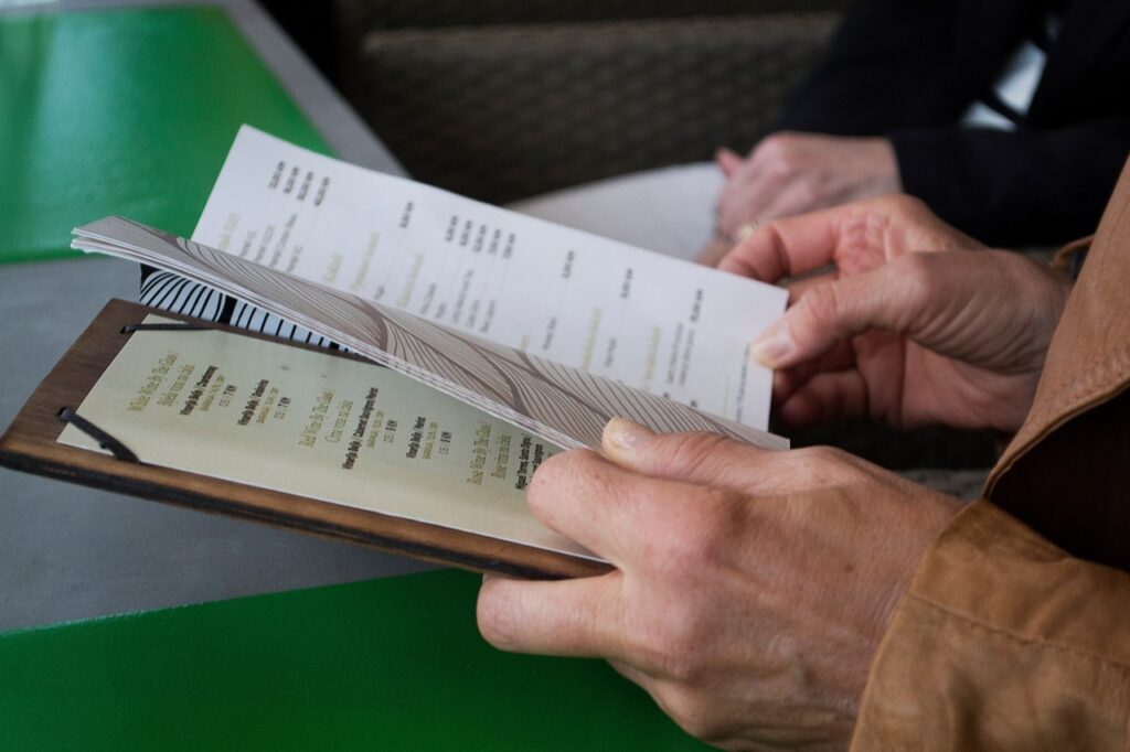
This Machiavellian approach to menu design extends far beyond your neighborhood bistro’s single-page offerings. From sprawling chain restaurant booklets to intimate fine-dining folios, the practice has infiltrated every corner of the industry. The consultant explained how lobster thermidor gets the bold 14-point treatment while the reasonably-priced chicken breast languishes in apologetic 10-point font, practically whispering its existence to potential orderers.
But font manipulation is merely the tip of the iceberg in this elaborate psychological warfare. When combined with strategic item placement, the liberal sprinkling of French terminology (because “pommes frites” sounds exponentially more expensive than “french fries”), and carefully calibrated ambient lighting designed to make patrons squint just enough to focus on the boldest text, restaurants report margin increases of up to 200%.
The digital revolution hasn’t dampened this typographical tyranny—quite the opposite. Early results from digital menu boards show similar success rates, with the added bonus of dynamic font sizing that can adjust based on inventory levels and profit margins in real-time.
As our industry source concluded, “We’re not just serving food anymore. We’re serving carefully curated visual experiences designed to optimize revenue per square inch of menu real estate.”
The next time you find yourself inexplicably drawn to the most expensive item on the menu, remember: it’s not your refined palate speaking—it’s 16-point Helvetica Bold whispering sweet profit margins into your subconscious.